No products in the cart.
From 27 July until the end of the summer holidays, the store will be open from 7:00 a.m. to 5:00 p.m.
Fast UK Delivery
Trade Prices on Bulk Orders
Premium Brands in stock
Pickup in Wembley Store
Menu
Categories
K rend colours
K rend colours - How to choose the right shade for your render
K Rend colours are easiest to choose when you start with your home’s fixed elements (roof, windows, brickwork) and then test a shortlist in real daylight. The same shade can look warmer, cooler, lighter or darker depending on sun direction, surface texture and surrounding materials – so the final colour you see is always a mix of pigment, light and finish.
If you are comparing systems, finishes and available options, explore our full k rend range to see what’s suitable for your project and how different textures can influence the look of a colour on the wall.
How k rend colours work (and why they look different on site)
K Rend coloured renders are factory tinted to provide a consistent base colour, but what you see on a finished facade is shaped by the finish, the light, and the environment. A smooth sample card or a screen preview rarely matches a textured render surface at full scale, especially once it dries and settles – use a K Rend colour chart as a starting point, then confirm with real samples.
Even within the same product line, different textures (for example, a scraped vs a finer finish) can scatter light differently, making the exact same colour read as lighter or darker on the wall.
Top factors that change colour perception
- Texture and grain size (rougher finishes create more shadowing, often reading darker)
- Direction of sunlight (south-facing walls can look brighter and warmer)
- Time of day and season (low winter sun vs high summer sun changes tone)
- Surrounding colours (roof tiles, brickwork, greenery, neighbouring properties)
- Moisture and drying (renders can look different while curing and after rainfall)
- Viewing distance (colours often appear lighter from a distance and stronger up close)
- Screen vs reality (monitor settings and lighting conditions distort colour matching)
How to choose a colour for your facade
Choosing a facade colour is less about finding a single “perfect” swatch and more about building a combination that looks right in your setting, in UK light, and with your home’s existing materials.
Matching the roof, windows and surroundings
Start with what you cannot (or do not want to) change:
- Roof colour and finish (slate, clay, concrete tile)
- Window frames and doors (white, anthracite, black, timber tones)
- Brick plinths, stone details, gutters, soffits and fascias
A practical approach is to decide whether the render should:
- Blend with the roof and frames for a calmer, more uniform look, or
- Contrast slightly to frame windows and architectural lines (careful contrast, not harsh)
If your area has a strong local character (period terraces, coastal properties, rural stone homes), keep your shortlist aligned with what naturally sits in the street scene – it usually looks more “right” over time.
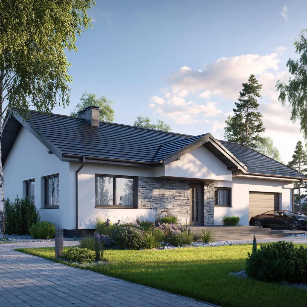
South-facing vs north-facing walls
Wall orientation matters more than most people expect:
- South-facing walls get stronger sun for longer, which can make colours feel brighter and warmer. Very light shades can appear almost white at peak daylight – if you are considering a clean off-white, compare K Rend white shades first.
- North-facing walls receive cooler, flatter light, often making colours look greyer or deeper. Creams can feel more muted, and mid-greys can feel heavier.
If your facade has multiple elevations with different orientations, test the same shortlist on each side. A colour that looks ideal on a sunny front elevation can feel darker on a shaded side return.
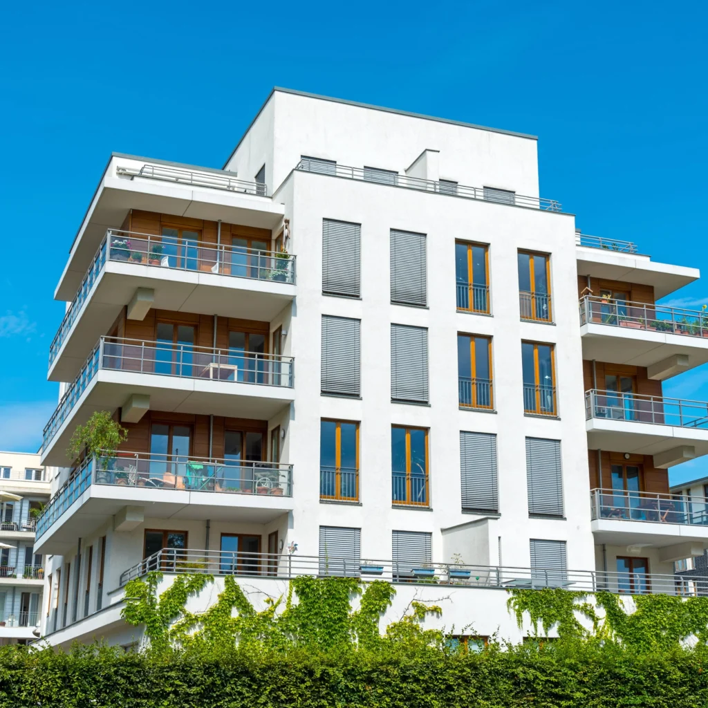
Light colours vs darker colours - maintenance and staining
Lighter colours tend to feel larger, cleaner, and more reflective, while darker colours can look contemporary and crisp. The trade-off is usually maintenance visibility, not maintenance itself.
- Off-whites can show soiling more easily, especially near ground level – if you want the safest option, compare K Rend white shades like Polar White vs Limestone White.
- Darker colours can show dusting, limescale streaks, and drying marks, and can make patch repairs more noticeable if the wall weathers unevenly.
To keep any colour looking consistent, details matter: good drip edges, correct window sill detailing, and tidy ground levels reduce streaking and splashback.
| Colour type | Best for | Maintenance note |
|---|---|---|
Off-whites and warm creams |
Traditional homes, brightening shaded facades |
Can show splashback near paths and driveways – consider a darker plinth zone |
Light greys and soft greige tones |
Modern-traditional blends, pairing with anthracite frames |
Usually forgiving, but test in shade to avoid an overly cool look |
Mid greys |
Contemporary elevations, clean lines and strong detailing |
Can emphasise texture – choose finish carefully and test at full scale |
Dark greys and charcoals |
Modern designs, feature areas, strong contrasts |
Streaking and uneven weathering can be more noticeable on large uninterrupted walls |
Earthy tones (sand, stone, taupe) |
Rural settings, natural materials, softer street scenes |
Often disguise everyday dust well; confirm they don’t read too warm in direct sun |
Samples and testing before you commit
Testing is the step that prevents expensive regret. Aim to shortlist 3-5 colours, then validate them with real-world viewing.
How to test properly:
- Order samples or request colour references that match the exact product and finish you intend to use – for a wider comparison across finishes and brands, use our full colour chart.
- View in outdoor daylight rather than indoors. Check morning, midday, late afternoon, and on an overcast day.
- Test next to fixed elements like windows, door colour, roof line, brickwork and gutters.
- Observe for several days – ideally 3-7 days – so you see the colour under typical UK weather changes.
- Scale matters: if possible, test a larger area (or multiple patches) because small swatches can mislead. Colours often feel stronger once applied across a full elevation.
Also consider how the colour looks:
- From the pavement and from inside the garden
- At the boundary with neighbours (especially in tighter streets)
- On detailing (returns, reveals, parapets) where shadowing changes the tone
Common mistakes when choosing render colours
Most colour issues come from skipping testing or relying too heavily on a single reference.
Common mistakes include:
- Choosing from a screen image (monitors and phone screens rarely show true colour)
- Not accounting for wall orientation (south vs north elevations can look like different shades)
- Ignoring the render texture (a rougher finish can make a colour read darker)
- Testing too small an area (tiny swatches don’t reflect how a full facade looks)
- Comparing samples indoors (artificial light often warms or cools colours incorrectly)
- Forgetting surrounding materials (roof tiles and frames can shift perceived tone)
- Picking extreme shades without considering upkeep (very light or very dark can make marks more noticeable)
- Assuming “one colour fits all elevations” (a feature wall or plinth zone can balance the scheme)
Related guides
If you are planning a full render or EWI project, it helps to review how finish choice, detailing, and substrate preparation affect the final look. Look for guidance on selecting the right render system for your property type, understanding texture options, and getting key details right (reveals, beads, sills and drip edges) so your chosen colour stays consistent and tidy on the wall.
Frequently asked questions
Do k rend colours fade over time?
All exterior finishes can change slightly over the years due to UV exposure and weathering. In practice, noticeable change is more often linked to environmental soiling and uneven exposure (for example, sheltered areas staying cleaner than open elevations) than dramatic pigment fade.
Why does the same colour look different on different walls?
Orientation, shadows, and surrounding materials can shift how the eye reads a colour. A north-facing wall in shade will typically look cooler and deeper than the same finish on a south-facing wall in strong sun.
Can I match a specific RAL colour?
Some projects aim to match RAL or other references, but exact matches can be difficult because render texture and natural light affect perception. The best route is to shortlist close options and confirm with physical samples in the actual setting.
Should I choose the colour based on a sample chart?
Use charts to narrow down options, but don’t make the final decision from a chart alone. Always confirm with real samples outdoors, and ideally at a larger scale, because charts are not a perfect representation of a finished textured wall.
How long should I look at a sample before deciding?
A minimum of 3 days is sensible, and 5-7 days is even better. Check the sample in sun, shade, and overcast conditions to see how it behaves in typical UK light.
Are light colours harder to maintain?
They can show splash marks and traffic film more easily near ground level, but they also tend to look crisp and reflective. Good detailing (drips, sills, tidy ground edges) reduces staining for any colour.
How do I clean light-coloured render safely?
Start with the gentlest method: a soft brush and low-pressure rinsing. Avoid aggressive pressure washing or harsh chemicals that can damage the surface or alter the finish. If in doubt, test a small area first.
Will a darker colour make my render look more textured?
Often, yes. Darker shades can emphasise shadows created by the grain and surface profile, making texture more visible. If you want a darker colour but a calmer look, consider testing finishes and viewing from typical distances.
Penguin BM
Phone: 075 1528 3453 Phone: 074 2438 1423 Phone: 020 8991 9590
Mon-Fri: 6:30AM - 5:00PM Sat: 6:30AM - 1:00PM Sun: Closed