K rend colour chart - download, compare and choose
A K rend colour chart helps you compare render shades and finishes so you can choose a colour that suits your property and the look you want. Because colours can shift on different screens and under different lighting, always treat a chart as a guide – the final appearance may look slightly different in real life. If you are selecting products or need help matching a finish, explore our full k rend range before you decide.
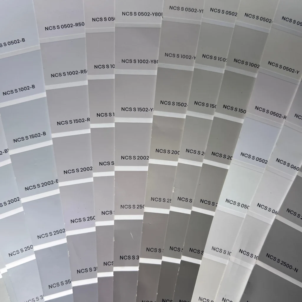
Download the k rend colour chart
Use the downloadable k rend colours chart as a quick reference when you are shortlisting shades, discussing options with your installer, or checking how a colour might sit next to brick, roof tiles, windows, and trims. For best results, view it on more than one device and print a copy for a more consistent comparison.
What’s included in the chart
- Core colour ranges (light, mid, and darker tones)
- Common facade-friendly neutrals (whites, off-whites, greys, and beiges)
- Example finishes (where applicable) to help you visualise texture differences
- A practical format for side-by-side comparisons and shortlisting
How to read a render colour chart correctly
Screen vs real-life colour
Screens do not display colour in a consistent way. Brightness, colour profiles, night mode, and even your viewing angle can change how a shade looks. A “warm white” on your phone may look cooler on a laptop – and different again outdoors.
Texture and finish impact
Render is not flat like paint on a smooth wall. The texture and finish can make the same colour appear lighter, darker, or more varied across the elevation. For example, a smoother finish can look cleaner and more uniform, while a more textured finish can show subtle shadowing and movement.
Weathering and dirt over time
External walls are exposed to rain, pollution, algae, and general day-to-day dirt. Over time, most facades develop slight changes in tone, especially on shaded or north-facing elevations. Very bright whites can show marks more easily, while mid-tone neutrals often hide everyday dirt better.
| What you see | What affects it | What to do |
|---|---|---|
A clean colour swatch on a screen |
Screen calibration, brightness, colour temperature |
Check on 2-3 devices and print a copy for comparison |
A shade that looks “warmer” or “cooler” than expected |
Natural light, time of day, shadows, nearby colours (brick, greenery) |
View options outdoors, next to existing materials and in different light |
A colour that looks flatter or more varied on the wall |
Texture, finish type, trowel application, jointing |
Compare finishes, and ask how the chosen system will be applied on site |
A bright facade that looks marked sooner |
Dirt pickup, algae, splashback areas, sheltered elevations |
Consider practical neutrals and plan detailing (drips, sills) to reduce staining |
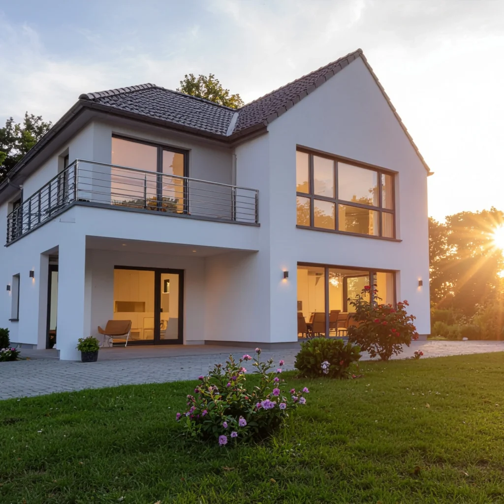
Most popular whites and neutrals
In the UK, whites and neutrals stay popular because they work with most roof colours, window frames, and brick details – and they suit both modern and traditional homes.
When shortlisting, think in terms of undertones and contrast:
- Crisp whites can look sharp and modern, but may feel cooler in shade and can highlight surface marks.
- Off-whites and soft creams often feel warmer and more forgiving, especially on period properties.
- Light greys suit contemporary elevations and pair well with anthracite windows and darker trims.
- Greige and stone-tones can balance warmth and modernity, working well with natural materials like timber and brick.
A practical approach is to match your render to fixed elements you are not changing (roof tiles, brickwork, paving) and then choose trims (sills, bands, window surrounds) to create the contrast you want.
FAQ
Is the chart accurate?
It is a reliable guide for comparing shades, but it cannot guarantee an exact match on every screen or in every lighting condition. Real-world results depend on light, finish, and application.
Can I get a sample pot?
Do batches differ?
Minor variations can happen between batches. Using products from the same batch where possible and mixing according to manufacturer guidance helps keep colour consistent across the facade.
Will the colour look different in shade vs sunlight?
Yes. Direct sun can make colours appear lighter and more vibrant, while shade can make them look cooler or slightly darker.
Does texture change the colour?
It can change how you perceive it. More texture creates micro-shadows, which can make a shade look deeper or less uniform compared to a smoother finish.
Will the render fade over time?
Most modern render systems are designed to be colour-stable, but the facade can still change slightly due to weathering and surface dirt over the years.
Are whites harder to keep clean?
Generally, yes – bright whites show marks more easily, especially near ground level, splashback zones, or under trees. Many homeowners choose off-whites or soft neutrals for practicality.
Can I match the render to my window frames or brickwork?
Usually, yes. The best method is to compare samples next to your fixed materials outdoors and check the look at different times of day.
Should I choose a lighter or darker neutral for my house?
Lighter neutrals can make a home feel bigger and brighter, while mid-tone neutrals often hide everyday dirt better and can add depth on larger elevations.
Contact, location and shop
Quick route to availability checks, collection in Wembley, or delivery planning.
- Store location
416 Ealing Rd, London, Wembley HA0 1JQ, United Kingdom
- Shop online